Brief
All non-US citizens (excluding Canadian citizens) traveling into the US through a land border are required to get an I-94 visa online prior to their arrival. The Customs and Border Protection (CBP) agency, who is in charge of this process, asked our team to improve the experience for travelers at the border by helping them be compliant with I-94 visa requirements ahead of time through a mobile application. Additionally, they wished to consolidate this experience with biometric exit, which would enable travelers to self-report their exit from the US.
Team: Mark Waks (Engagement Manager), Amber Kearney (Product Manager), Kelly Jacobs (UX), Gio Quinteros (Visual)
Timeline: 7 months
Challenge
CBP really needed to modernize the way it manages US borders, not only to improve the experience of travelers, but also to empower border agents to conduct their responsibilities more effectively. At southern land borders, traffic back-ups at a border entry can be hours long. This causes stress for travelers who are frequent commuters and border agents who are burdened with administrative tasks such as handling passports and directing traffic, which distracts them from their responsibility to vet the people with whom they are interacting.
Opportunity
In addition to I-94 and biometric exit, there were plans to create mobile capabilities for other processes, which included a border wait times application and eligibility to use a quicker frequent traveler lane at the border. Our design team had the opportunity to design a solution that could scale for the entire spectrum of capabilities that CBP needed to offer travelers. Additionally, we wanted to create a user-centered solution that would build trust between travelers and border agents, while increasing compliance, shortening wait times at the border, and alleviating unnecessary administrative tasks that border agents have to handle.
Skillset
User research, service blueprinting, information architecture, prototyping, usability testing
Toolset
Whiteboards, sketch, justinmind, principle, pen and lots of paper
Mindset
If you want to go quickly, go alone but if you want to go far, you must go together." - African proverb
Discover
The start of a mobile transformation
Prior to my rolling onto the project, our studio team had visited a border to observe both travelers and border agents to understand their day-to-day process, understand their mental models and pain points, and watch the current border crossing technology in action.
The outputs of this visit consisted of raw interview notes, user personas, journey maps, mental model maps, and diagrams of the physical border. In addition to I-94 and biometric exit, other work streams were trying to figure out where their mobile solution would fall within the spectrum.
Key question for our team: Would all mobile capabilities for crossing a border fit into one app?
Unpacking the US border experience
While I didn't conduct this research first hand, my first pass at understanding it led me to think that we needed to bring all of these disparate pieces into view. I recommended we create a service blue print as a way to consolidate research and understand the user journey from multiple perspectives. I worked with the initial UX designer to create a blue print that mapped out the traveler's journey, the interactions with officers, and the underlying systems with which they engaged. This enabled multiple work streams to level-set on how the current environment is with one document.
Our team's key takeaways
Upstream traveler decisions prior to the border have direct impact on border agents. Therefore, in order to be successful, our solution needed to mitigate the challenges faced by officers. This means having effective touchpoints with travelers before they even begin their trip to the border.
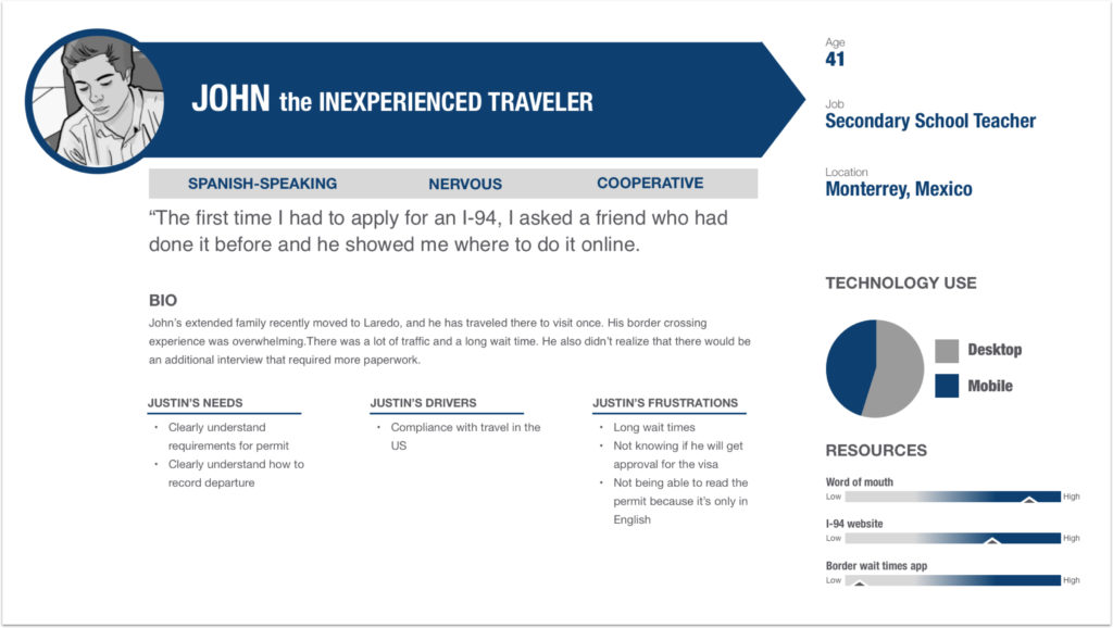
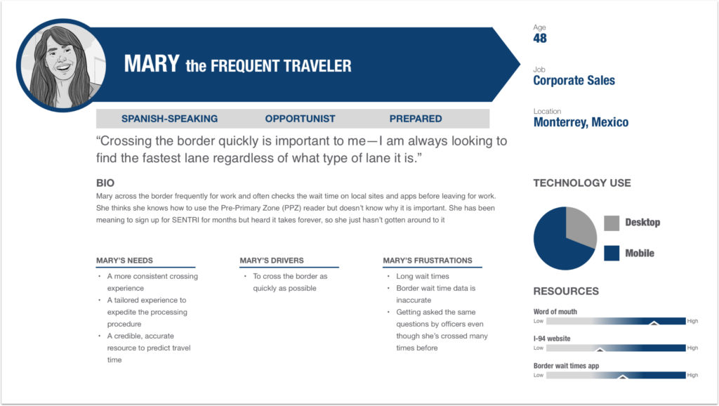
Frequent travelers are a primary use case for our solution. From our research, we learned that individual, frequent travelers who must commute into the US on a daily basis for school or work will benefit the most from a time saving app.
Match between system and real world is key. Our solution would be replacing a process that is already in place and also adding to it with the process of biometric exit. In addition to interactions between agents and travelers, wayfinding was another large interaction at play. So, I decided to pay close attention to how I messaged the dialogue within our design to match that of the broader border infrastructure.
Internal discussions around these research outputs led us to the conclusion that this all had to sit under one app. People don’t download an app to search for available flights and then a separate app for purchasing tickets.
The answer to our initial question was yes.
We needed to build a solution that could support the entire travel experience in order to make crossings more efficient for travelers, especially for frequent travelers, and set better expectations for agents, creating more trust between the two.
Once travelers start using the mobile app for I-94, it would be easier for travelers to be compliant with biometric exit. Using data from the app at all travel touchpoints, we could achieve CBP’s objective to increase traveler compliance with I-94 and biometric exit and empower border agents to pre-vet travelers before they reach the physical border so agents could manage face-to-face interactions with more peace of mind.
Ideation
Using anticipatory design to future proof the IA
How do you design an app that can engage with a user before the “sticky” feature (border wait time) of the app is added? The solution we were designing for first was I-94 and biometric exit, yet we needed a framework that would allow this initial focus to eventually be replaced and downplayed in the app. Additionally, we needed to make it worthwhile and useful to both new and experienced travelers. It’s also worth mentioning that this is the first time ever that CBP would be enabling biometric exit on a mobile device – a completely new process for them and for travelers.
These are the discussions that drove our design team’s early ideas regarding the mobile app’s architecture. From nicely organized cards to I-94 visa expiration countdowns, most ideas regarding the architecture and what the homescreen should be were too flat.
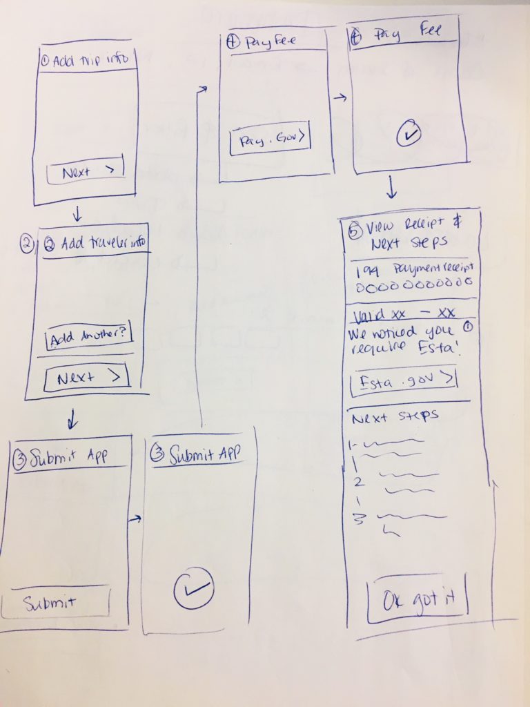
Sketches of my ideation of the homescreen and the IA
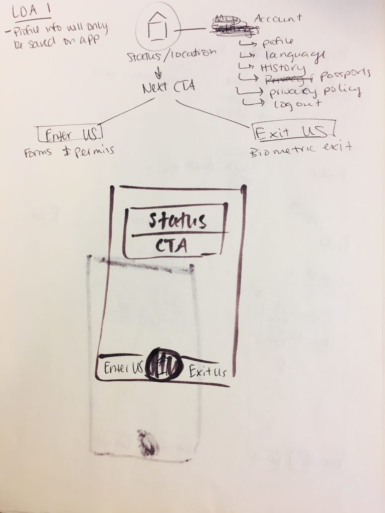
I realized that if the I-94 visa process was to be as important as the new biometric exit process, they needed to have equal priority within the app’s hierarchy. Since location technology was also an aspect of this solution, I wanted to overuse this to our advantage.
Therefore, I decided to start ideating on frameworks that were based on the traveler’s journey of entry and exit, while using the system’s location services to anticipate what a user should do next. This concept provided the emphasis we needed for both I-94 and biometric exit, while providing a place for future features.
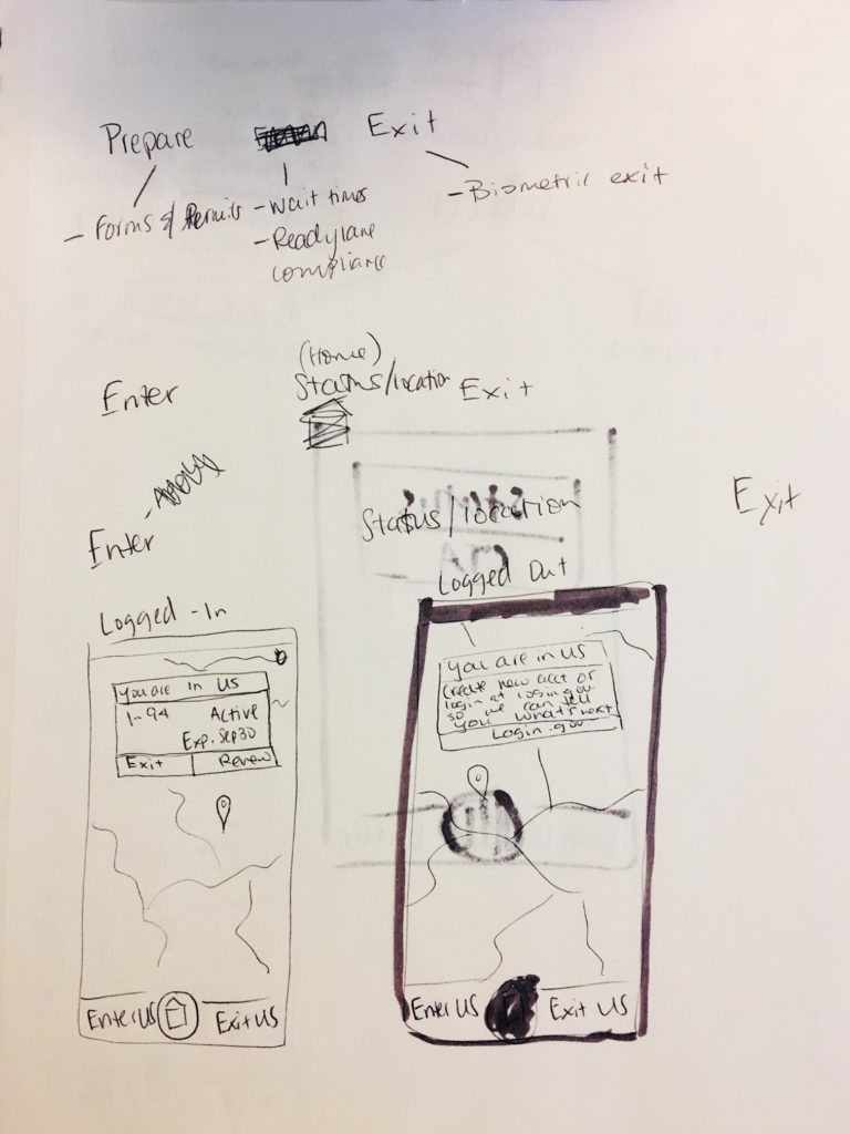
Sketches of my ideation of the homescreen and the IA
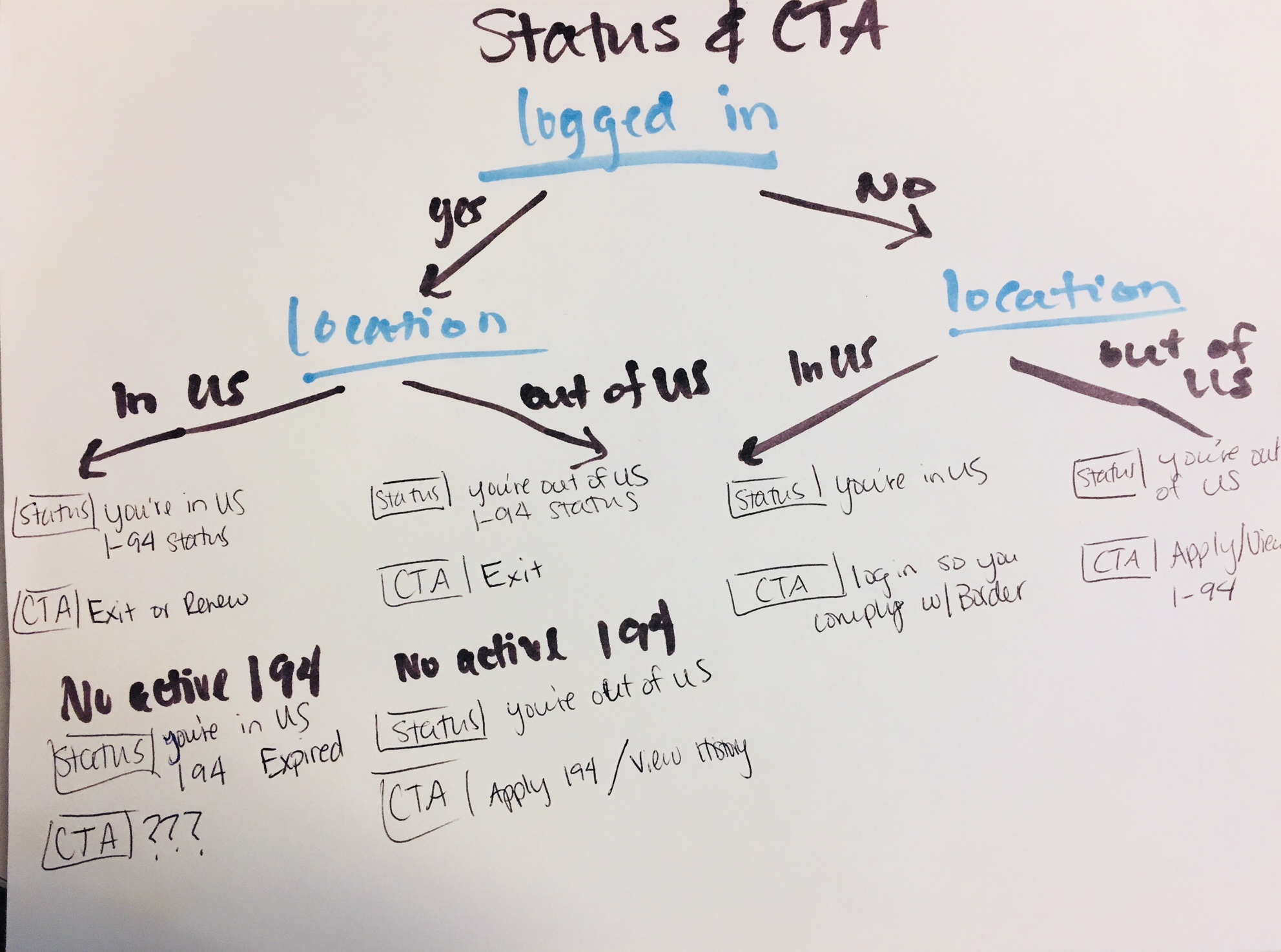
To make sure this concept scaled, I developed a framework for the homescreen call-to-action to make suggestions to a user based on different scenarios. Location was the minimum requirement we would need to help a user anticipate the next step.
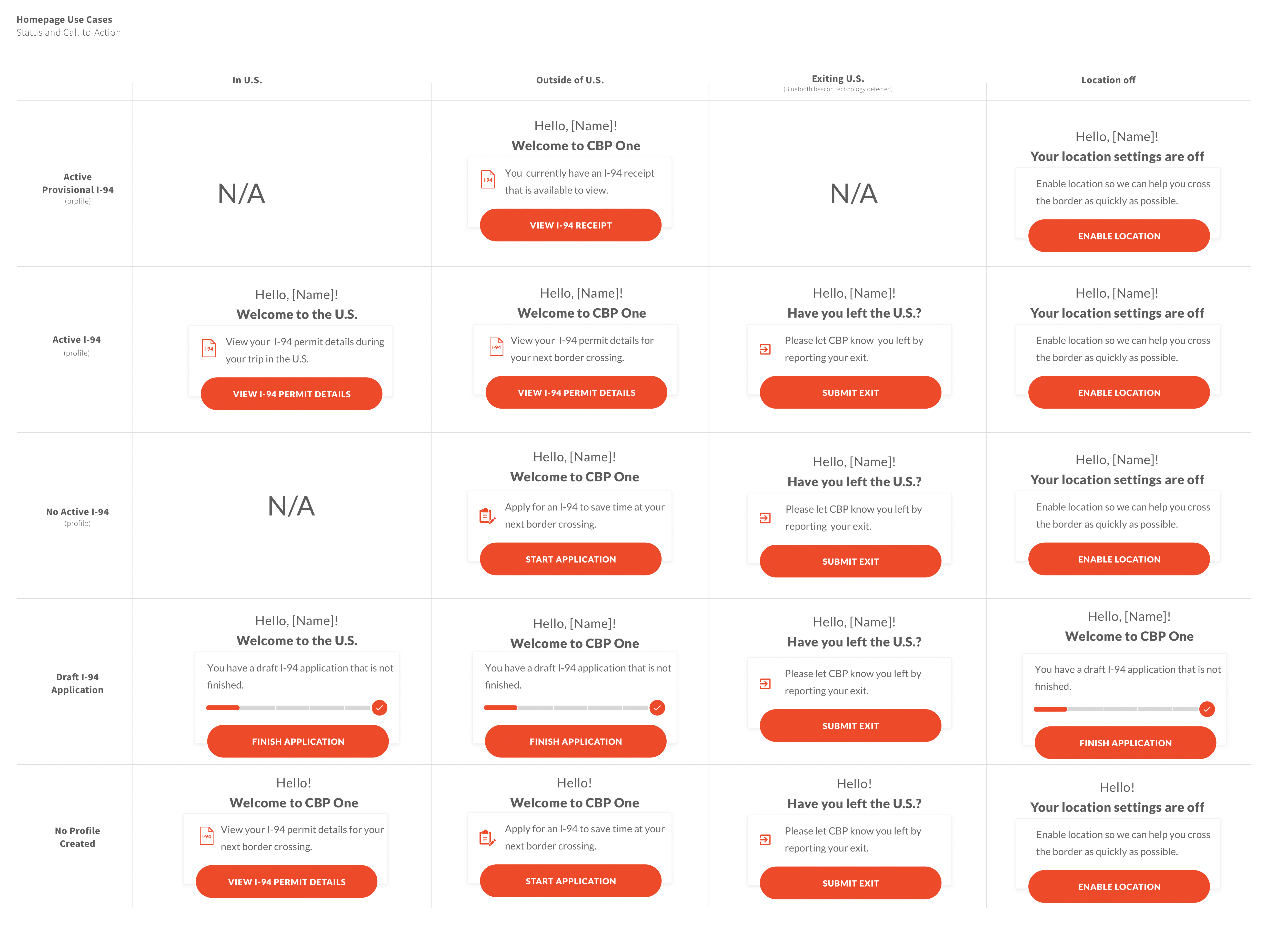
A call-to-action framework I created to anticipate the next step for a user
Once more features were added, we could grow this framework to continue to bridge the gap between CBP objectives and user needs.
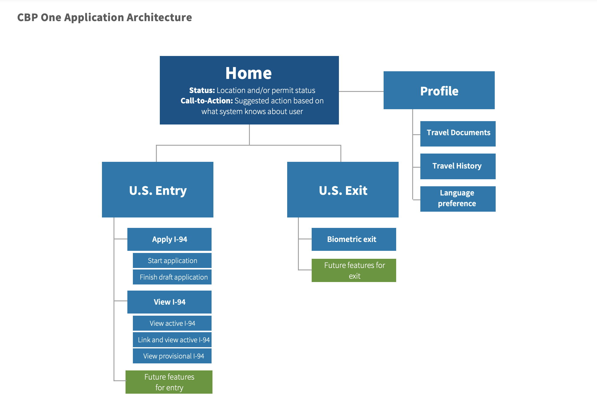
A site map I created to depict the applications information architecture
Ideation
Blurring Removing the line between UX and visual design
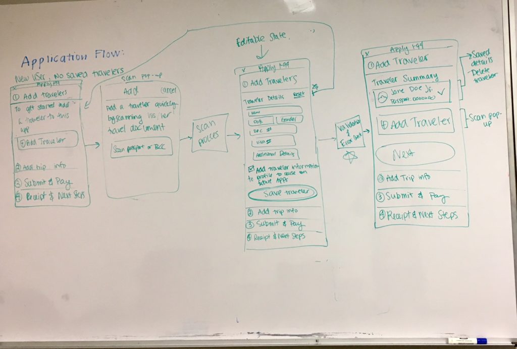
With a decision for the IA made, Gio and I moved forward with designing the I-94 application and biometric workflows. Over the course of 4 sprints, we designed over 300 screens for iOS and Android and created over 5 prototypes, leveraging our user research and using our assumption to prioritize the single, frequent traveler use case. Additionally, we checked in with the external development team on a weekly basis for a technical feasibility review.
Our greatest asset was our ability to collaborate and eliminate the unnecessary line that our studio draws between UX and visual workflows. We were able to completely skip the wireframing hand off by drawing out our ideas for the coming sprint first and then divvying up the work. I built designs directly within the visual comps framework and shared with Gio to check for pixel perfect-ness. Vice versa, he shared his designs with me, and we made all UX decisions and changes together.
Sketches I sent to Gio
This type of collaboration meant that we were really, really fast. We experienced scope-creep, back and forth decisions, which had waterfall impact on our designs that had us constantly doing and re-doing the same work. However, we delivered within our timeline, and I am certain this would not have been possible without our unique way of working together.
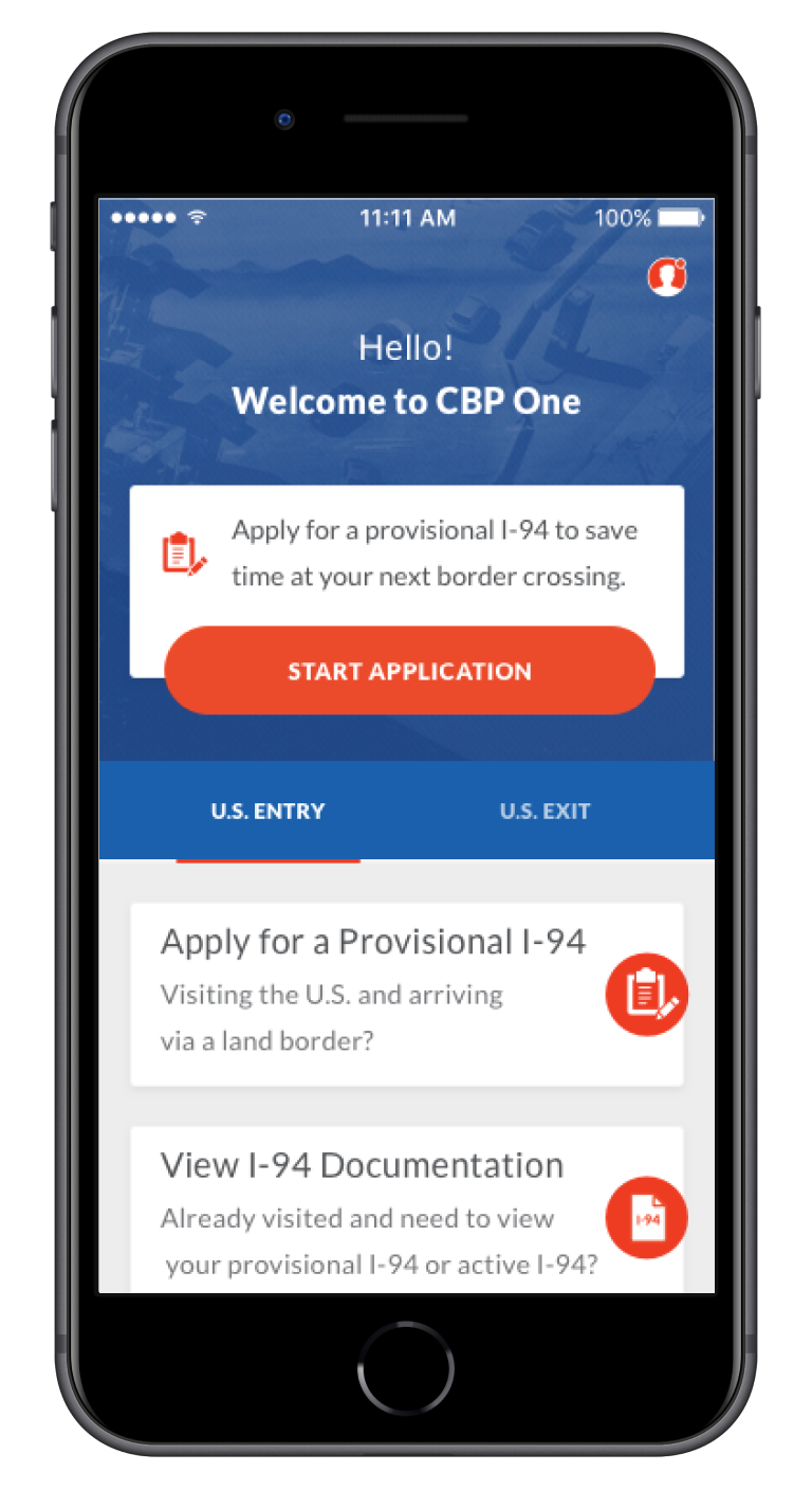
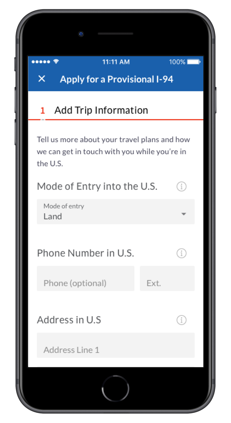
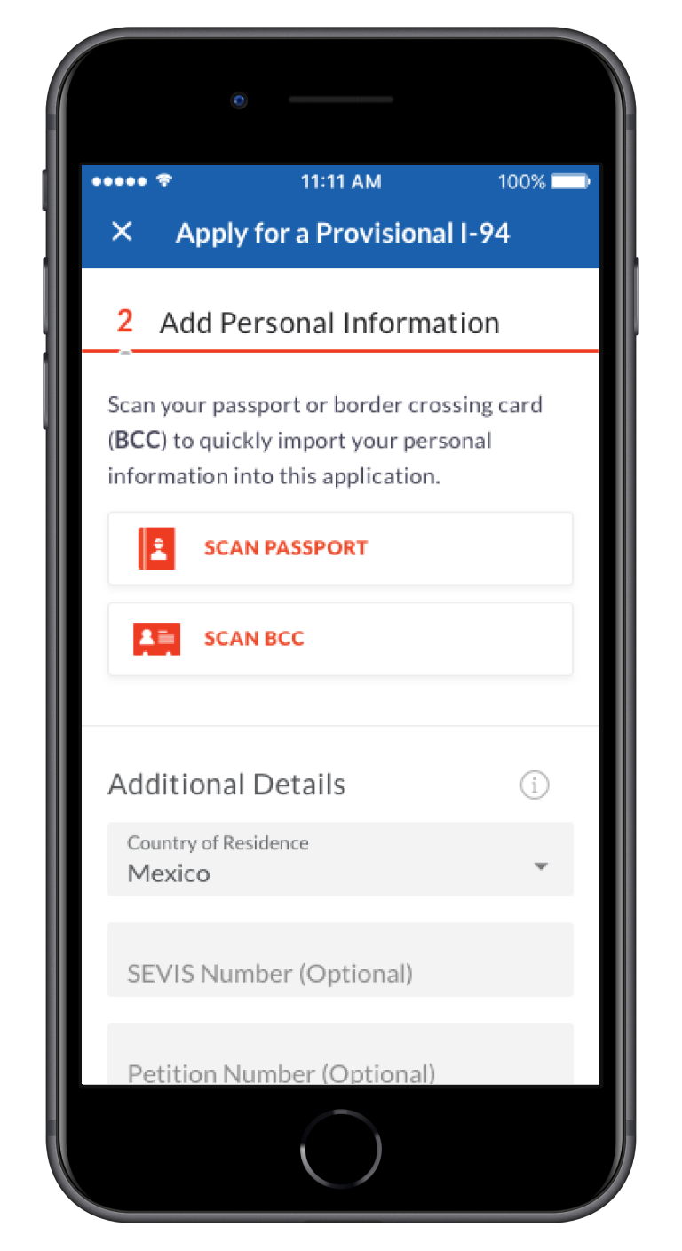
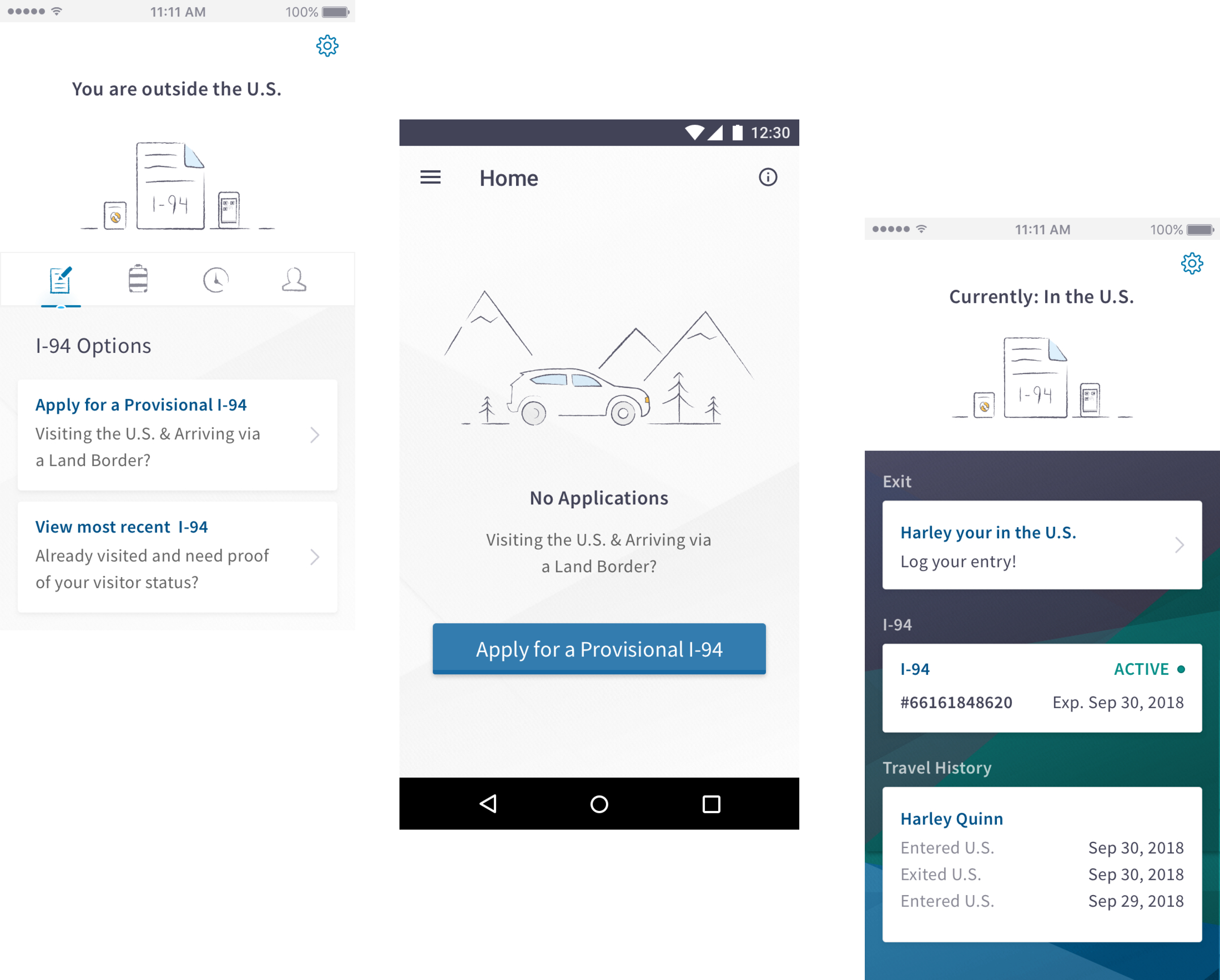
In addition to the visual comps, Gio and I created prototypes in principle to demonstrate transitions and other micro animations to provide further guidance to the developers. View the demos below to see how we designed the I-94 application and the biometric exit flows.
Usability testing
Location, location, location
I led usability testing by working with a partner of our client to borrow participants from a separate CBP study to test out our solution. I started by identifying a series of scenarios that focused on the primary workflow of the app and then examined the findability of secondary areas and workflows. After building the test script, I created a prototype that allowed participants to work through the scenarios on an actual mobile device. I chose to create the prototype in Justinmind in order to enable participants to type in their own information and see see it transacted downstream in the application, simulating a real-world experience.
"I don't normally enable location services, but since this app has to do with travel it makes sense that I would turn it on"
Every single person, out of the 12 people we spoke with, decided to enable location services because the app had to do with travel and saving time. After experiencing onboarding that made note that the app would save time, people generally responded that they believed location would have some benefit later on, even if they generally never turned this service on in other apps they use.
"Since this is a government app I feel comfortable providing my passport number."
A majority of participants expressed that seeing the government logo upon loading the app elicited a sense of trust and made it easy to provide a sensitive document number.
"I never thought I would have to read all of the information at the end and know all of this other information."
A large challenge with the current I-94 process is that even though a person can apply and pay for it online ahead of the trip, a person isn’t actually approved until he/she shows up to the border, has an interview with a border agent, and provides additional proof of solvency [link to definition]. Some travelers end up getting rejected for lack of proper paperwork, which is really frustrating. Our app had minor success addressing this. While most people understood there were more steps to take at the border after completing the application, the way we messaged those steps wasn’t 100% clear.
In addition to these takeaways, we saw the large call-to-action on the homepage perform very well. Every single person decided to start tasks through this route. After consolidating our findings, I created a report that documented these results and created a table of recommended changes for our client to make to the designs based on what we found.
Handoff
So then what happened?
While our team had weekly check-ins with the development team, our designs were not implemented in the way we had intended. Amidst a transition of contracting teams and politics, a lack of a strong product owner resulted in an unraveling of our original design framework. The technical team was not sold on our decisions and decided to follow a combination of their own and decisions of other contractors. We did our best our pivot and deliver on the new design direction in order to get the product shipped. We initiated several collaborative sessions with the development team to get them designs that more closely aligned to their decisions.
A picture of the output of a working session I led with CBP developers
This result was a little bit disheartening, but I think it is probably a reality of how getting real products into the world works. It’s messy. Multiple mobile solutions are still being piloted at US border crossings, and I hope my initial “future-proofed” IA is strong enough to last.
Retrospective
What I learned
Holy shit I learned a lot about getting buy in. We did not get buy in from the technical team. They nodded at our designs every week and started to pay attention when it was time to build. Decisions cannot get made in a design team silo. This project has permanently updated my perspective on how full stack teams can really be successful, especially when they are from separate companies. It has permanently updated the way I engage with and get feedback from engineers who are from our internal studio.
The product owner has to believe in you. We were not successful in eliciting the necessary level of trust and confidence from our product owner, and this eventually led to the issues we encountered with the hand off later on. Many times, when the product owner couldn’t show up or couldn’t decide, designers and developers were left to sort it out amongst ourselves.
Native mobile app design. I learned how to optimize designs for mobile devices and how to optimize for native iOS and android development. I am now someone who constantly pays attention to micro-animations and the way apps behave.
Messaging matters. I have always firmly rejected using lorem ipsum in my designs, and this project validated this perspective even more. I paid close attention to every single instruction and explanation that I wrote into our designs, and usability participants read all of them (mostly). Caring about the conversation - what we say and the order in which we say it - builds trust. The way we talk to people who use our products can never ever be an afterthought.
How to use Principle. I spent my entire Labor Day weekend of 2017 building out the entire application in Principle, based on the animation groundwork laid by Gio, for an internal demo that ended up never happening. I regret none of it because I was able to learn a new tool that has enhanced every design I have delivered since.
Interested in working together? Say hi.
Contact
Email: kellyjacobs417@gmail.com
Whatsapp: +01 540 200 5690