Brief
The student loan market has seen the startup of small personal finances companies who offer customers more affordable options to manage their student loans. Departing from the traditional loan company, brands such as SoFi and Prosper are simple and approachable. The largest Federal student loan servicer approached Deloitte Digital to design a refinancing solution that could compete with these experiences.
Team: Kelly Jacobs (UX), Zeinab Mohtadi, Susan Dove (Visual)
Timeline: 1.5 months
Challenge
The client had already built the backend, and our solution had to take multiple steps of system validation and varying scenarios as well as 11 proposed screens from the client into consideration. The client wanted our team to design the solution quickly and base it on our knowledge of student loan users and design best practices. Oh, and it had to be mobile responsive.
Opportunity
I conducted a thorough analysis on the client’s top competitors and leveraged this research in order to convince the client of a unique, conversational design approach to engage with the customer. Through this approach, I was able to consolidate some of the proposed steps from the client and eliminate others in order, reducing time and cognitive load for the user.
Skillset
Competitive analysis, user flows, wireframing, prototyping
Toolset
Sketch, Principle, pen, paper, and a lot of whiteboard space
Mindset
"Design is more of a conversation than a monologue" - Kelli Anderson
Discover
What's so great about SoFi
On every design project that I have ever been on, whether it is an expected client deliverable or not, I always spend time examining competitor solutions. Not only direct competitors, I identify the core elements of my design challenge and look for groups who are solving for these elements in a good way. For this client, the number of steps they requested to be incorporated into their solution was a core element of this challenge. So, I decided to examine the number and types of steps their competitors required by going through parts of their application process myself. I consolidated my guerilla research into a deliverable for our client, which I used to support the unique design concept I would present for this solution.
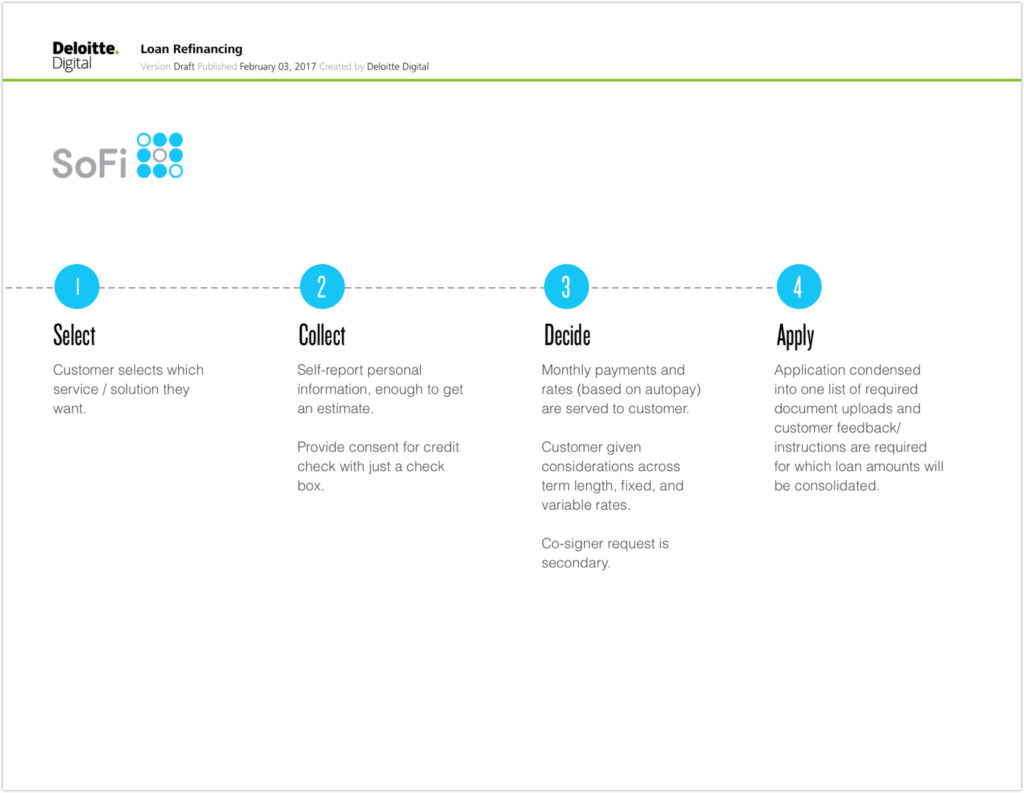
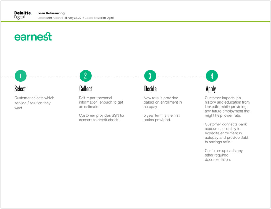
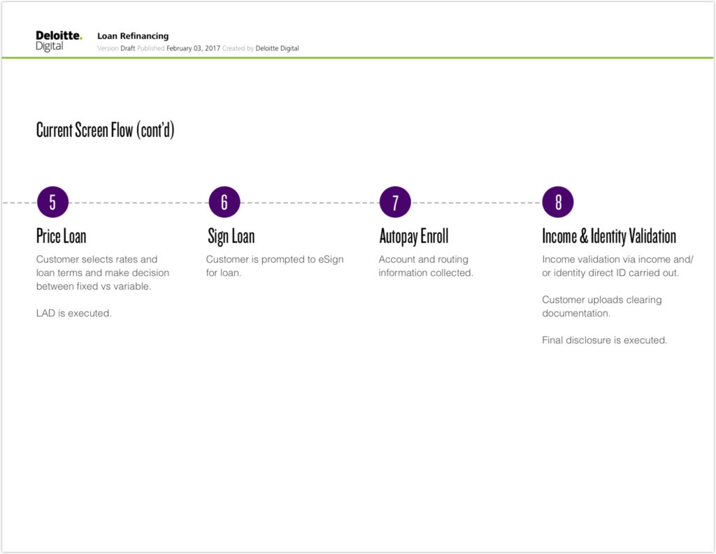
A sample from the competitive analysis I conducted to call out the problematic number of steps
I presented this analysis to our client as a way to convey the importance of cutting some unnecessary steps from their flow and reordering them. While they didn't take every recommendation to remove and rearrange, this analysis did open the door for the alternative overly conversational approach I would show in my wireframes in the next sprint. Feel free to look at the complete analysis I delivered with an additional appendix that details some of my thought process.
Key takeaways from my analysis
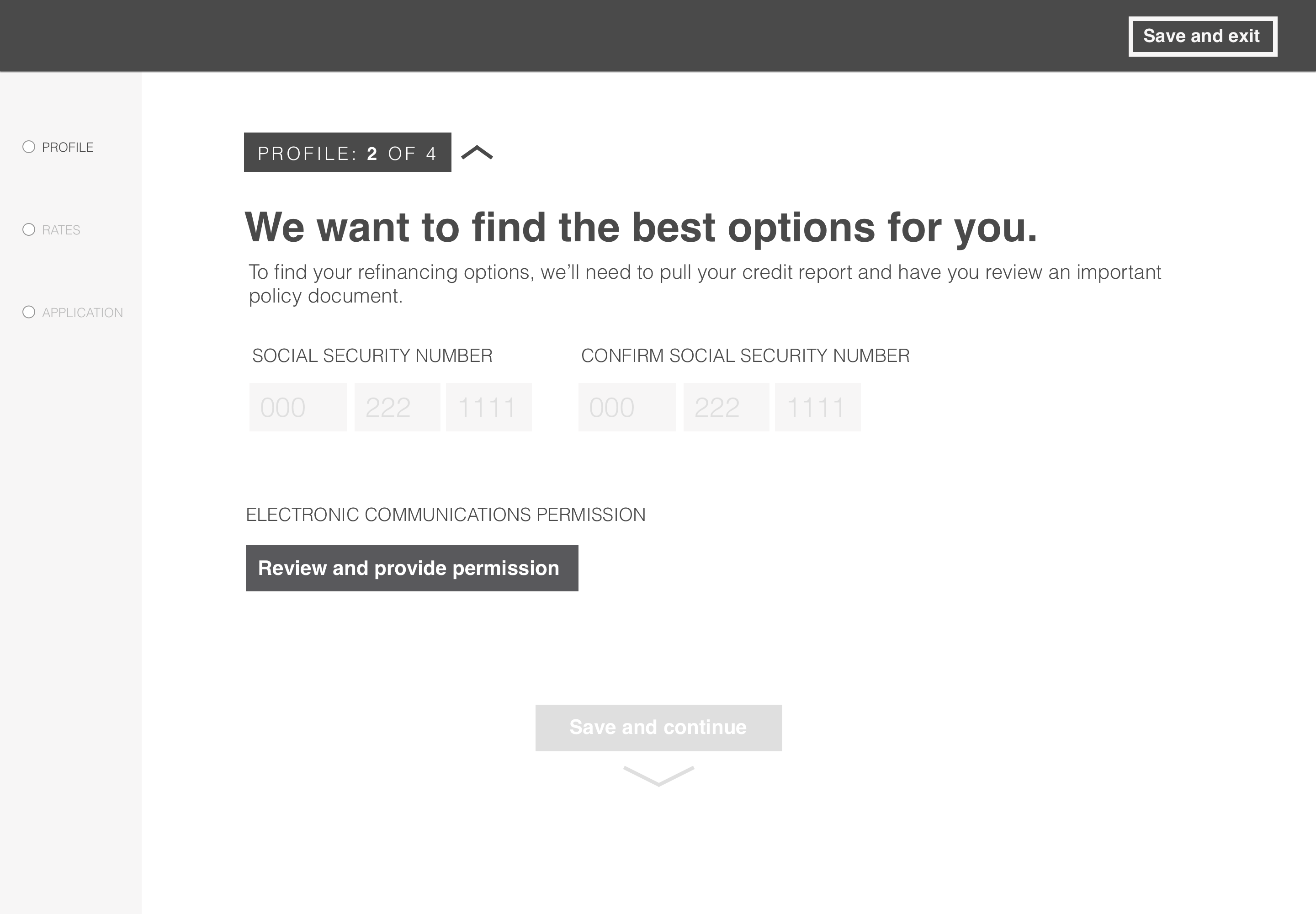
Give and take builds trust. Systems that asked for personal information little by little versus all at once were easier to trust. I was more comfortable providing my social security number to systems that asked it later rather than on the first screen.
Get users to the price point faster. For refinancing, a user can decide to proceed once the system presents the estimated rates based on the user’s credit. Therefore, if our client wanted to convert customers, the pace of our solution needed to focus on revealing the best estimated rates to users as quickly as possible.
Show progress in a light-weight way. I realized that I needed to categorize and design progress indicators in a subtle way so that it was informative, while making the number of steps ahead seem less daunting.
I wanted to create a slippery experience.
There were a lot of steps that were required for the user to take. I saw a major opportunity to leverage page scroll and field interaction patterns that would minimize the dialogue on the screen, and reward the user for inputting information correctly by automatically advancing the user down the page. My intent was to make the experience seem slippery and fast.
Ideation
Building the conversation
In addition to the number of system steps, the user was required to either view or provide consent for legal disclaimers at certain points in the process. These requirements made designing a simple, trust-worthy experience that got users to the price point fast even more difficult. I ideated on different path sequences and conversation flows by breaking the conversation down with flash cards and sticky notes, rearranging different parts until it was as succinct as possible, given the requirements.
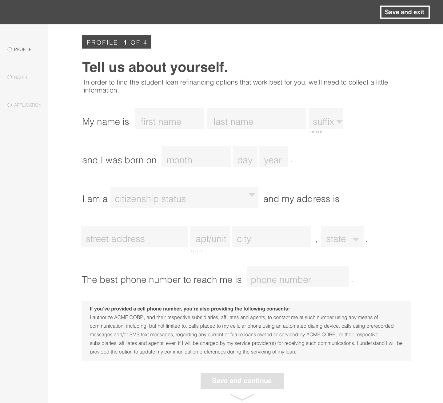
It was important to start incorporating high-fidelity copy at this point in the design process since sequence of information was so critical to the experience. Furthermore, explaining loan refinancing in a simple way is an important aspect of our dialogue and couldn’t be overlooked.
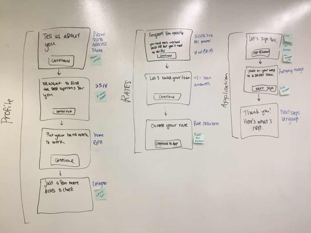
Iterating through how to organize the steps
Design
Making a slippery experience
In addition to relying on industry-standard design best practices, I wanted to make this solution stand out through interaction patterns that would make this experience really easy to move through.
Key takeaways from my analysis
Give and take builds trust. Systems that asked for personal information little by little versus all at once were easier to trust. I was more comfortable providing my social security number to systems that asked it later rather than on the first screen.
Get users to the price point faster. For refinancing, a user can decide to proceed once the system presents the estimated rates based on the user’s credit. Therefore, if our client wanted to convert customers, the pace of our solution needed to focus on revealing the best estimated rates to users as quickly as possible.
Show progress in a light-weight way. I realized that I needed to categorize and design progress indicators in a subtle way so that it was informative, while making the number of steps ahead seem less daunting.
To see how these elements of the experience work together, check out the prototype I built in principle
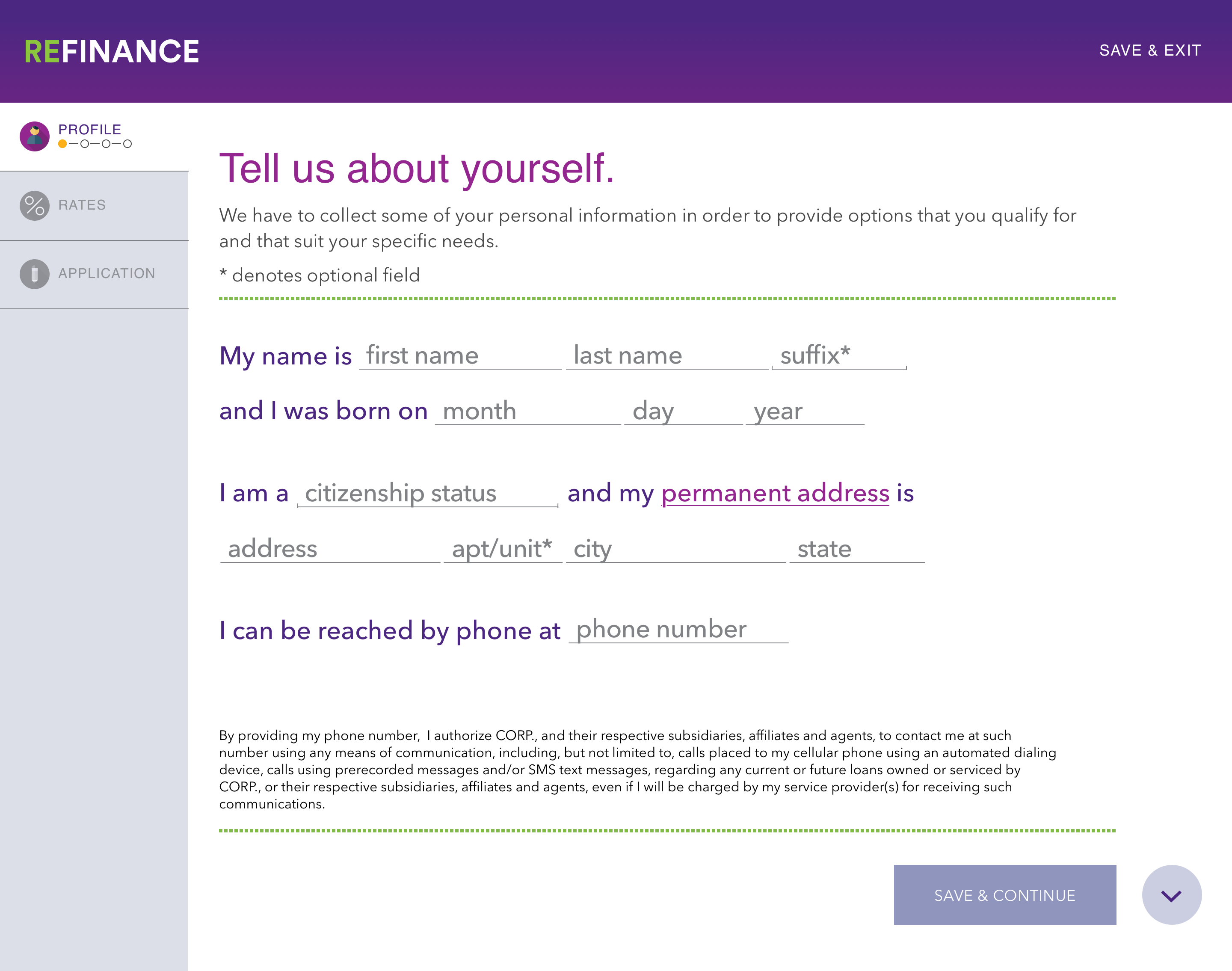
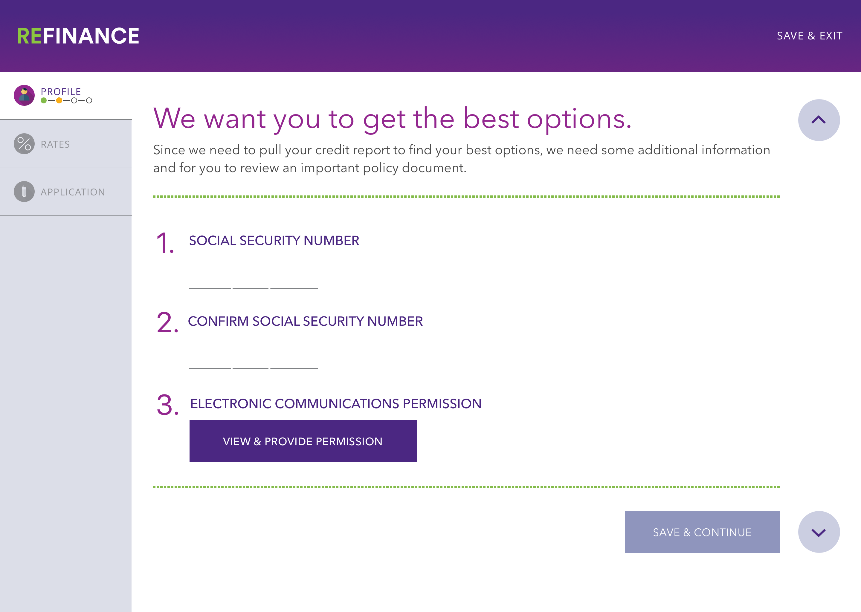
Our UX and visual teams worked closely to translate the "light weight" notion of the wireframes I created into high fidelity mock ups
Retrospective
What I learned
Change is hard. Convincing the client can be really hard, and on this project, we weren’t always successful. For example, the client had predetermined that users would be able to retrieve their applications with a 12 digit code that the system would generate if they decided to leave the application early. I proposed they allow storage based on a user name and password, not only because this is what users expect on modern financial applications but also because it is obviously easier to remember a personal login versus a random code. Even though they desired to compete with modern, friendly brands like SoFi, it was very difficult for them to accept conventions that would put their experience on a level playing field. This was a challenge we had to navigate across different elements throughout our process.
Taking my designs from the macro and the micro level. As a content-first designer, I have always been passionate about solving complex problems through designs that offer clean, user-driven information architectures. I love when I client comes to me with a multifaceted set of content requirements and needs a solution that simplifies how their customers access it. This project allowed to take this passion many steps further to think deeply about how my designs would support their complex set of uses cases from the site flow level all the way to the microinteractions at the individual field level, hiding a lot of unnecessary information for users throughout the experience.
Interested in working together? Say hi.
Contact
Email: kellyjacobs417@gmail.com
Whatsapp: +01 540 200 5690